Monday, June 1, 2015

Cooking Panda

Cooking Panda is a company founded in 2010. They have a Facebook page which they used to provide fans with cooking recipes, latest food news and examples of works they or other people have done. I came across this page and I found some cakes which I loved. They tend to have several cakes including a similar theme and I don't know if the bakers are actually making them separately and comparing ideas or if they just have had a large amount of orders for the specific themes.


The cakes they make are just incredible in my opinion. They have found their main genre and worked on it amazingly. Each cake is just so detailed and beautiful, even the cupcakes. Some of their cakes just have so much look at which kids love, but it also shines to a slightly older generation as well as a lot of young adults and teenagers would also have high interest in cakes like these since they were prime films and characters for that generation as kids and a lot of them are still so in love with Disney because it brings back a lot of child hood memories.


As you can see I just love this company as I think it is so similar to my genre choice. I love Disney and I love decorating cakes that children would want because you can add so much more personality and character to your cakes, you can use lots of colors and make a really fun piece. You can get away with making some things out of proportion because kinds have large imaginations and it doesn't matter as such, although you can also make really beautifully detailed things as well and experiment with the structure of the cake as well because kids love over the top crazy things so you can really do as little or as much as you'd like with this genre.

The English cake company

I am again looking at local cake companies to admire the talents for possible future competition. The English cake company is a great example of a really fun and exciting cake company. The cakes they make completely put you in the mood for whatever occasion your celebrating because they present their cakes with so much character. Although some of the cakes are fairly simple to make, you can still see that a sense of passion has been included, ad their cupcakes in particular are just so eye catching.
I find these cup cakes so unusual, although they are't the most extravagant cakes, they are certainly eye catching and beautiful, and I've not seen cup cakes made like these before. Some of them almost remind me of sea urchin shells which I personally quite like.

These festive cupcakes are a great demonstration of how much character this company can add to their cakes, it is admirable because no matter what age you are you just feel happy looking at them and their so enticing.

These are an example of how they can make more delicate looking cakes and expensive looking cakes, I believe the decoration on these will have been piped which is really quite a difficult skill to do on such a small surface area.

Again this image just shows character and a sense of fun.

I've made cakes very similar to these before so I know that they are fairly simple to make, however they are pretty to look at.

This image shows diversity in the company and shows that although they are generally making fun and characterized cakes, they can also make sophisticated cakes which is a good skill to have in the business.


The English Rose Cake Company

The English Rose cake company is based in Sheffield and is designed to suit the customers wants and needs meaning they would get a say in the design process, rather than just selecting a cake. This will make it very popular as it means picky brides can get what they want or specific birthday themes can become a reality. They create all genres of cakes from christenings to birthdays to weddings or any occasion a customer wants one for.


You can see in these images I've selected, how much their themes can range and how beautiful and detailed some of their work is, however I've also found some errors with this company. Some of these reasons are a lack of images on their specific website gallery. This makes it hard to understand the quality of their work, however on their Flickr I have found quite a lot more images. On both sites I have found some cakes which are quite disappointing to me personally.
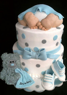
I think that these shoes could have been produced a lot  better. The edges of the shoes are rugged and bent and are just not molded to a high standard.

And this cake just lacks any kind of talent or skill or time consumption. They have used a flower tool (which I also own) to cut out the flowers and indents into them. This cake just appears boring and lacking and I know that this style of cake can take around ten minutes to make which I'm sure a customer would be slightly disappointed with at the least.

I find it strange that this company can range from such high quality cakes which are so beautiful and time consuming to make with work full of detail to then create cakes which are badly sculpted or made or have no passion or effort received into them. This either means that the cake company is so busy that some things have to be rushed and not finished perfectly; that they were previously quite poor at making cakes and have completely advanced to match other people in the business; or they have several artists of different abilities.


Cake Masters Magazine

Cake Masters is a magazine issue which sells world wide, but is most popular with in the UK.
I decided to look at this company as it is more local to me than most of my inspirations I've previously looked at. This shows me the standard of  some companies with in the cake business which are more relevant to me.

Cake Masters magazine give top tips on how to do exquisite cakes for all occasions and the issues link monthly to current events seasons or dates, such as summer themes, Christmas themes, Easter themes, wedding themes, birthday themes and many more. They give you a list of the best equipment you can use to create the piece and they guide you through how to do it with the best tips on how to do so, I.E the best piping tip-end and size to use and the motion in which to use it.

The variation of the cakes is amazing and it covers a wide surface of genres and tastes as they include lots of different artists/bakers works.

For me personally, this image represents how high the standards are of local cake decorators and this is because not only is it visually beautiful and fun but it is also got a sense of structure and you can see how much hard work has gone into putting this cake together.

Cake magazine also includes competitions within the issues, which means that they're also offering opportunities for in-established bakers to become recognized.

The magazine issues will often have a couple of show stoppers or eye catching larger and more advanced cakes with in them and then have several smaller and simpler works with in them. I think this is good because it means less advanced or amateur bakers can start with the simpler methods and techniques and work their way up. It also means that the reader will learn how to create a perfect center piece but a long side that how to make appetizers as well.

Cake Masters also have a Facebook page where people can enter competitions and where they show local cake decorators works.
                                       https://www.facebook.com/CakeMasters

These last two images of cookies really caught my eye as so much beauty and detail has been produced and they literally look like art work, only they're edible which I absolutely love and admire. For me, having art work with purpose and to be used in another way then being visual, and especially if it's edible, is my ultimate goal.

Friday, May 29, 2015

  • I started off by setting out my pans. I had a large silicone pan which I used for the larger bottom section of my cake stand; a smaller tin which could open to release the base, which I lined with grease proof paper; and I had small rounded silicone cases which I was to use for the legs of my stand.
  • I then went on to heat my sugar and water. I made a mistake the first time around as I added too much water. I then had to restart it as the sugar wouldn't set with that quantity of water.
  • I then made the correct measurements of water and sugar which ratios should be 2 parts sugar 1 part water. I kept stirring it at first so the sugar would dissolve into the water. I then left it to simmer and waited until it was a yellowy brown color before removing it from the hob. At the start of heating I would have it on a low/medium heat as I was scared for the sugar burning, however because I was doing it in a large bulk, towards the end I would up the heat to medium/high and kept an eye on it.
  • I then poured the mixture into the large pan and had to make another batch ready for the second pan.
  • I did the same technique again to melt the sugar. This method used a lot of sugar and water, I probably used around two large bags of sugar during this experimentation.
  • I then had to think how to create the center column to hold the tiers of the stand. I was working on a low budget so I couldn't afford to spend any more on molds or equipment to make my own molds so I made a tester mold out of a cup which I cut to make it rounded and duck tape to secure it. When I poured sugar into it though, where there was small gaps in-between the plastic, the sugar would seep through and melt through the tape.
  • I then tried this test again with a better version of this test making sure the plastic was as tightly pushed together as possible, however there was still the tiniest gaps which the mixture melted through. Another mistake I made in this was that I was so anxious to make this and get this going after so long doing this that I took the sugar off the heat too quickly, which meant it wouldn't set or harden properly.
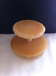
  • This process ended up taking a few days for me to get all the pieces done properly. I then used the same molds I used for the legs to make the column for the center. I made them and then used melted sugar to glue them to each other making a stack of them. I then used the melted sugar to attach all the pieces, which worked well in some ways since it was strong and edible and the same mixture used through out; however some issues with it is that it can actually slightly melt through some pieces, dis-shaping them slightly if too much of the sugar is added, also if it cools too quickly from touching the cold sugar, it can dry fairly tacky and need cleaning up after.
  • As you can see when it is done it does hold well and it is very strong.
  • In future I could experiment making more edible stands using different materials, I've thought about making hard biscuit stand or isomalt stands or even rocky road stands.


making a modelling chocolate figure


I started off by using a polystyrene ball and I used a sharp tool to keep the head steady in the stand. I covered the ball in white modelling chocolate and pinched the edges and smoothed it over to appear circular.

  • Afterwards I used my fingers and thumbs to indent where the eyes will be. I used some extra chocolate and made an over-sized nose to add character. I used a pointed tool to firstly cut the nostrils out and then I used a rounded tool to shape them.


  • I then used dark modelling chocolate which I used for making the mustache eyebrows and pupils of the eyes. I used a sharp tool to score into the eyebrows and mustache to give them some details.
  • For the eyes I used some more white chocolate and rolled two equal circles out. I used edible glue (a mixture of TYLO and water) to attach the eyes and used my rounded tool to flatten them into place. I then used the same techniques for the pupils.
  • I then used some thin strands of white chocolate to make the eyelids which I blended more at the top to just add some definition.


  • I then made some ears using white modelling chocolate and a rounded tool to shape them. Again I enlarged them, like the nose, to add more character.
  • I then used dark chocolate to make some hair. I added a little flick into his hair to show some movement with in it or some shape.


  • I removed the head and left it to one side to set.


  • I then started the legs by using two cake pop sticks to hold the legs up. I rolled out white chocolate into a baggy jeans shape. I placed the sticks into the legs at this stage once they were shaped so I could add details once they were attached. I added a pocket and used a tool to make some creases to add some detail.


  • I then used edible colors to paint the trousers to appear like jeans. To do this I mixed blue and black to create a dark blue. I added some water in parts so the color distribution was slightly irregular. I also used my fingers to dab some of the color off. This was to create a jeans effect.


  • I then used dark chocolate to make a T-shirt shape. I used another cake pop stick which I attached into the legs through the T-shirt and left sticking outwards. I used white chocolate to make a neck and attached it along with the head so that I could blend the still soft modelling chocolate into the head to make sure they're attached properly.
  • I used my rounded tool to make fairly deep holes into the sleeves so I could later attach the arms. I also rolled out a little bit of dark chocolate the make a lining for the neck of the top.


  • Finally I made some white chocolate arms. I used a sharp tool to indent fingers and to cut the thumbs. I used my edible glue to attach the arms into the sleeves and also a little bit onto the hand touching the stomach to hold the weight. I did this again to add some character or movement rather than being a stood still figure. Once it had set more I made some little shoes which I attached underneath the jeans.

These are some of the links I used as research.
  • https://www.youtube.com/watch?v=yoQ66ef-GN0
  • https://www.youtube.com/watch?v=m3Zmwu-Emrc
The second link I was heavily influenced by. When I watched it I followed several steps to learn how to do the face of my man. As I went along I adapted some of the steps to match the character I wanted for my man. For example I made mine younger and to show that I didn't add wrinkles and I added hair. I also made my man skinnier in the face by not adding chins and making the features quite large on the face. I also made the nose a slightly different size and shape along with the mustache and then I added ears and a body.